Pokémon Logo Designer Revealed

When the president of Nintendo of America calls unexpectedly, you answer without hesitation. That was the advice designer Chris Maple received from a colleague in 1998, shortly before receiving that very call. As founder of Media Design – a Seattle-based firm specializing in rapid turnaround projects – Maple was accustomed to last-minute corporate requests. His studio had quietly built reputation creating materials for clients like Boeing, the Seattle Mariners, and Holland America Line, though rarely receiving public credit.
The Unexpected Pokémon Assignment
When Nintendo's secretary summoned Maple to their Redmond headquarters, he arrived to find an intriguing crystal horse head displayed in the corporate lobby. "There was this beautiful 21-inch crystal equine sculpture," Maple recalls. "I remember studying it while waiting, trying to read the corporate environment."
Upstairs, Nintendo president Minoru Arakawa delivered the pitch: they needed a new logo for their Japanese "Pocket Monsters" franchise ahead of its Western debut as "Pokémon." Maple remembers the moment clearly: "They dumped this box of toys and concept art on the table. When I asked what it was, Arakawa simply replied, 'It's Pokémon.'"
The 30-Day Design Sprint
Given just one month before E3 1998's launch announcement, Maple began sketching variations by hand on a light table. With minimal assets – just a small Pikachu figurine and early Nintendo Power references – he created multiple iterations, knowing the design needed to work both in color and on GameBoy's monochrome screens.

 View 8 Images
At the presentation, Maple recalls Nintendo executives' reaction to his preferred design: "Don James suddenly said, 'I believe this is the one,' while shaking his head. Arakawa just nodded and said, 'Mm-hmm.' That was it – they told me to produce it."
Color Psychology and Final Adjustments
Maple tested various color schemes before settling on the now-iconic yellow and blue combination. While the games were launching as Blue and (later) Yellow versions in the West, Maple insists the choice was intuitive: "It just felt right," he explains. Post-E3, Arakawa requested minor tweaks to the letterforms, resulting in the final version known worldwide today.

The Cultural Impact Revealed
Maple first grasped the franchise's magnitude when seeing his logo emblazoned across a Toys "R" Us display months later. "It was this massive installation with TVs and arches," he remembers. "I just thought, 'Holy smokes.'"
Though his subsequent Nintendo projects included redesigns for the Atomic Purple N64 and packaging for games like Ken Griffey Jr. Baseball, Maple's Pokémon work remained uncredited for decades. Now, 27 years later at his son's urging, he's sharing the story. "For all the people invested in these games," Maple says, "don't they deserve to know how it happened?"

 View 4 Images
Preserving the Legacy
As Pokémon approaches its 30th anniversary, Maple expresses hope to be involved: "Whoever handles the anniversary logo needs to treat it with TLC. There's an energy and structure to the original that deserves respect." Though he modestly claims, "I just did my job responsibly," Maple acknowledges the logo's cultural significance: "When I teach kids and they find out? Forget about it – they just want me to draw Pikachu."


-
As Stellar Blade surpasses 3 million global sales, director Hyung-tae Kim confirmed its sequel will feature a "more substantial" narrative—though development priorities initially led to significant story cuts in the first installment.Speaking with ThAuthor : Charlotte Apr 25,2026
-
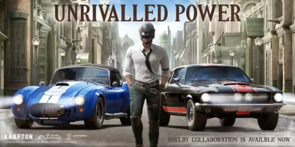 PUBG Mobile's latest automotive partnership brings Shelby's iconic vehicles to the gameBoth the GT500 and 427 Cobra models will be available for playersThese classic performance cars deliver stylish high-speed action that appeals to enthusiastsAutomoAuthor : Liam Apr 23,2026


![A Father’s Sins – Going to Hell [Ch. 7 Public] By Pixieblink](https://img.laxz.net/uploads/67/1719578270667eae9eb6a75.jpg)