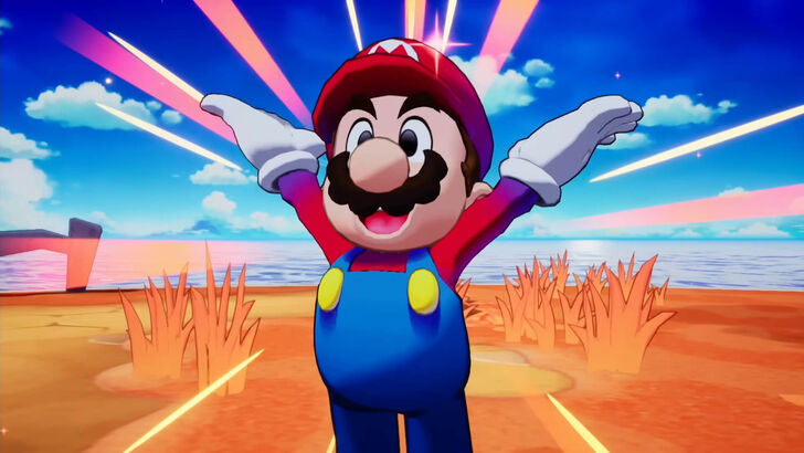
Mario Bros. Potential Revamp Denied by Nintendo
The beloved plumber brothers, Mario and Luigi, almost got a grittier, edgier makeover in their latest game. However, Nintendo stepped in, ensuring the final product remained true to the franchise's established identity. This article delves into the development process of Mario & Luigi: Brothership, revealing how the art direction evolved.
Early Designs: A Rugged Reboot
Initial concept art showcased a more rugged and edgy interpretation of the iconic duo. (See images below). However, this departure from the familiar aesthetic prompted feedback from Nintendo. Developers Akira Otani and Tomoki Fukushima (Nintendo) and Haruyuki Ohashi and Hitomi Furuta (Acquire) discussed the creative challenges in balancing innovation with the established Mario & Luigi style.
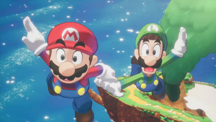
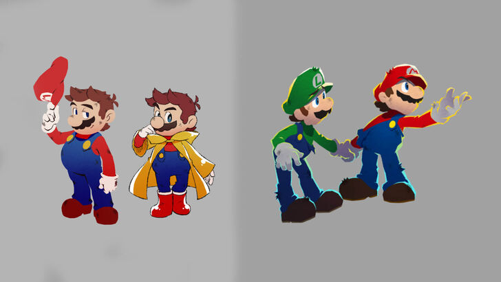
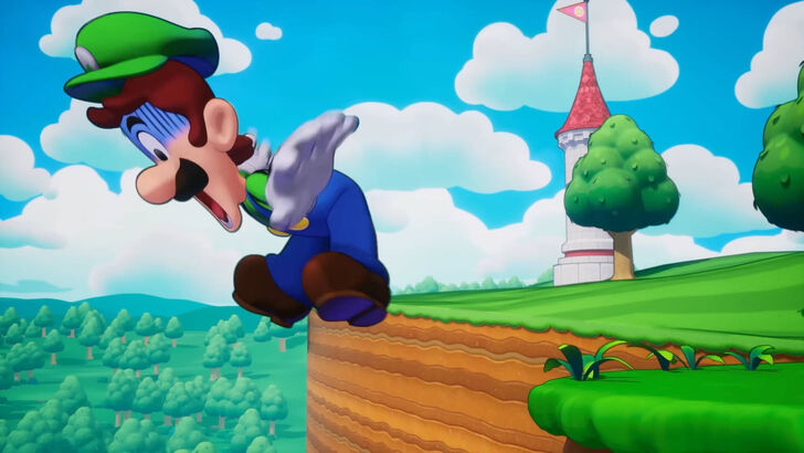
Furuta explained that while exploring a more mature aesthetic, Nintendo emphasized the importance of maintaining the series' core identity. The feedback led to a reevaluation, resulting in a style that blended the appeal of bold illustrations with the playful charm of classic pixel animation. This involved incorporating elements like solid outlines and expressive black eyes, while retaining the fun, chaotic energy inherent to the Mario & Luigi games.
A Collaborative Process
Otani highlighted the collaborative effort, emphasizing the balance between allowing Acquire's unique style to shine and preserving the essence of Mario & Luigi. This creative tension ultimately shaped the game's distinctive visual identity.
Acquire's Perspective
Acquire, known for titles like Octopath Traveler and Way of the Samurai, typically works on darker, less vibrant games. Furuta admitted that without Nintendo's guidance, they might have inadvertently steered the project towards a more serious tone. The experience of working with a globally recognized IP presented unique challenges, but the final result reflects a successful collaboration and a commitment to delivering a fun and accessible experience. The team learned from Nintendo's design insights, leading to a brighter, more player-friendly world. The final product demonstrates a successful merging of creative visions.
-
As Stellar Blade surpasses 3 million global sales, director Hyung-tae Kim confirmed its sequel will feature a "more substantial" narrative—though development priorities initially led to significant story cuts in the first installment.Speaking with ThAuthor : Charlotte Apr 25,2026
-
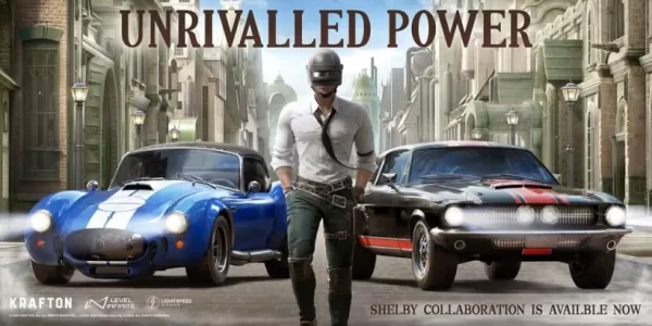 PUBG Mobile's latest automotive partnership brings Shelby's iconic vehicles to the gameBoth the GT500 and 427 Cobra models will be available for playersThese classic performance cars deliver stylish high-speed action that appeals to enthusiastsAutomoAuthor : Liam Apr 23,2026


![A Father’s Sins – Going to Hell [Ch. 7 Public] By Pixieblink](https://img.laxz.net/uploads/67/1719578270667eae9eb6a75.jpg)