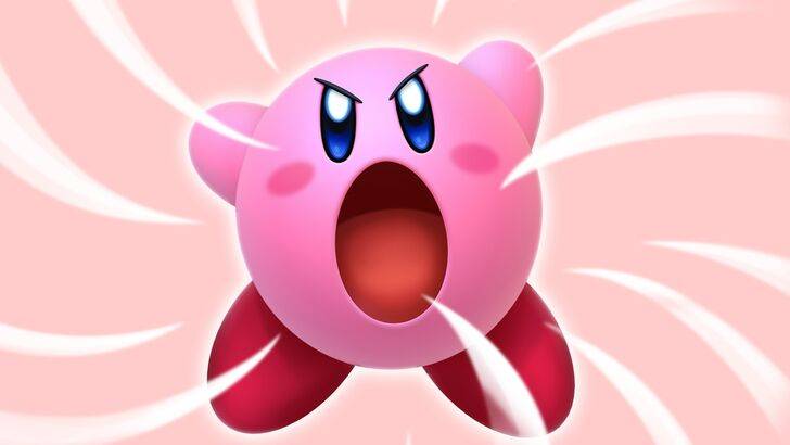
\"Angry Kirby\" Explained by Former Nintendo Employees
Former Nintendo employees shed light on why Kirby's appearance differs between the U.S. and its original Japanese design. Dive into the reasons behind Kirby's unique marketing approach in Western markets and Nintendo's evolving global localization strategy.
"Angry Kirby" Was Made To Appeal To Wider Audiences
Nintendo Rebranded Kirby For More Appeal In The West
Kirby's fiercer, more determined look on game covers and artworks was designed to resonate with American audiences, earning the nickname "Angry Kirby" among fans. In a January 16, 2025, interview with Polygon, former Nintendo Localization Director Leslie Swan elaborated on the decision to alter Kirby's appearance in the West. She explained that while Kirby's cuteness is universally adored in Japan, U.S. tween and teen boys are more drawn to characters that exude toughness and determination.
Shinya Kumazaki, the director of Kirby: Triple Deluxe, told GameSpot in 2014 that while Japan prefers the adorable Kirby, the U.S. market responds better to a Kirby that appears to be fiercely battling. However, he noted that this varies by game, citing Kirby Super Star Ultra, which featured a tough Kirby on both U.S. and Japanese box art. Kumazaki emphasized that while the gameplay aims to showcase Kirby's serious side, his cuteness remains a significant draw in Japan.
Advertising Kirby As "Super Tuff Pink Puff"
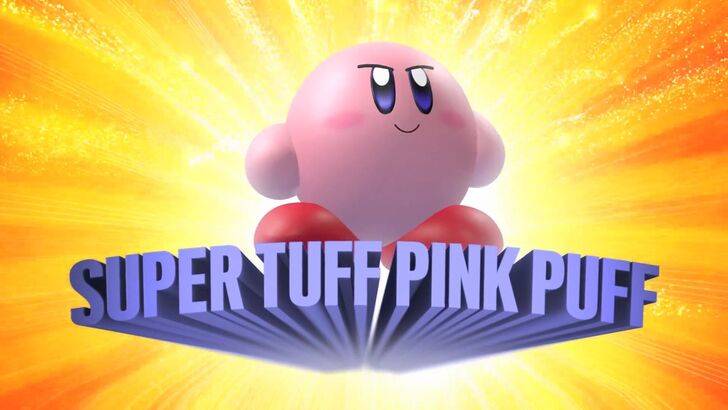
To broaden Kirby's appeal, especially among boys, Nintendo marketed him as "Super Tuff Pink Puff" for the 2008 Nintendo DS game Kirby Super Star Ultra. Former Nintendo of America Public Relations Manager Krysta Yang revealed that Nintendo aimed to shake off its "kiddie" image during her tenure. She noted, "There was a push to make gaming more adult and cool, and being labeled 'kiddie' was a disadvantage." Nintendo's marketing shifted to highlight Kirby's combat skills, distancing him from being perceived solely as a children's character. In recent years, the focus has shifted more towards Kirby's gameplay and abilities, as seen in promotions for Kirby and the Forgotten Land in 2022. Yang observed, "There's an ongoing effort to portray Kirby as a more versatile character, though he's still primarily seen as cute rather than tough."
Nintendo’s U.S. Localization For Kirby
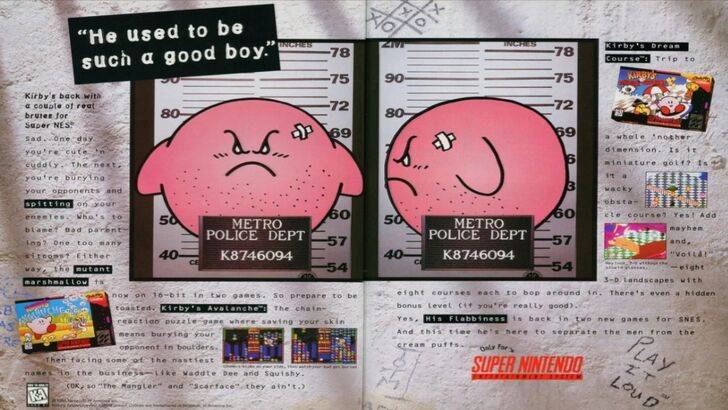
The localization differences for Kirby began with a 1995 print ad featuring Kirby in a mugshot as part of Nintendo's "Play It Loud" campaign. Over the years, U.S. box art for games like Kirby: Nightmare in Dream Land (2002), Kirby Air Ride (2003), and Kirby: Squeak Squad (2006) showcased Kirby with sharp eyebrows and a meaner expression. Beyond facial expressions, early adjustments included changing Kirby's color from pink to a ghostly white on the U.S. box art for Kirby's Dreamland (1992) on GameBoy, which had a monochrome display. It wasn't until Kirby's Adventure on NES in 1993 that U.S. players saw Kirby's original pink color. Swan remarked, "A puffy pink character wasn't appealing to boys trying to be cool, which impacted sales." Consequently, Nintendo of America adjusted Kirby's appearance to appeal to a broader audience. In recent times, Kirby's global advertising has balanced between serious and gleeful expressions.
Nintendo’s Global Approach
Both Swan and Yang noted that Nintendo has adopted a more global approach in recent years, with Nintendo of America collaborating closely with its Japanese counterpart for consistent marketing and localization. The focus is on moving away from regional variations like the 1995 Kirby ad. Yang commented, "The shift to global marketing is a strategic business move, ensuring brand consistency but sometimes overlooking regional differences." This approach can lead to more generic marketing but reflects the broader trend of globalization in the gaming industry. Western audiences are increasingly familiar with Japanese culture, thanks to the widespread influence of games, anime, manga, and other media.
-
 Now is your chance to grab a top-tier OLED TV at one of the lowest prices we've spotted, particularly for a recent 2024 Samsung model. Currently, both Samsung Shop and Amazon are offering the 65" Samsung S85D 4K OLED Smart TV for just $999.99 with frAuthor : Hazel May 08,2026
 -
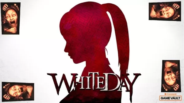 It Has Multiple Endings-----------------------There are nine different endings, all based on the relationships you build with other trapped students. Saving them, ignoring them, or sacrificing them changes where the story goes and what kind of horrAuthor : Hunter May 07,2026


![A Father’s Sins – Going to Hell [Ch. 7 Public] By Pixieblink](https://img.laxz.net/uploads/67/1719578270667eae9eb6a75.jpg)